Design Development
What is the design?
The current design is geared toward users interested in finding new volunteering opportunities but not knowing where to start. It has a linear flow where the user can search for opportunities in a specific area, find out more about the events, sign up, and then are thanked and directed back to the browsing page.How is this design responsive to user needs?
Having our target user being akin to our “Here for it Harry” persona, we designed the site with the people in mind, typically students, who want an overview of varied but consistently relevant volunteering opportunities in their area and the chances to explore with others. These needs were primarily expressed through off-put high school students who felt forced to volunteer, despite that after most events they felt they had fun. One event they discussed which did involve friends and a more social aspect, creating lunches, was well received and is still talked about today. Other more social events with large amounts of interacting with others, like helping out a 5K, also seemed to attract more students. Because of this, we chose to increase the ease of sending links to opportunities to friends. The ability to quickly breeze through the site if you really wanted to also supports the persona of a student who simply wants to find a volunteer opportunity to get the job done while avoiding the surprising amount of contact work some opportunities involve.How well does it meet user needs? In what ways does it fall short?
From our user visits we discovered a large frustration with finding opportunity contact information and following through. Volunteer event information was often on paper flyers or in excel spreadsheets. Information about events and contact information was often ambiguous or difficult to come by (for example "If you are interested in helping out call Sally at…"). Obtaining contact information was often inconvenient. It requires substantial activation energy to reach out to the organizers and follow up with events. Many young people bypassed this awkward searching phase by talking to people they already had relationships with, which limits their potential impact.Our site provides a convenient way for users to find and sign up for a volunteer events. Curating information so the user doesn’t have to, the site has seamless communication between organizer and volunteer. Users are able to see photos and background information on the organizers and contact them in-website, avoiding difficult email chains and games of phone tag. It also makes it easy for students to share the events with their friends as discussed above.
Ideating, Listening, & Iterating
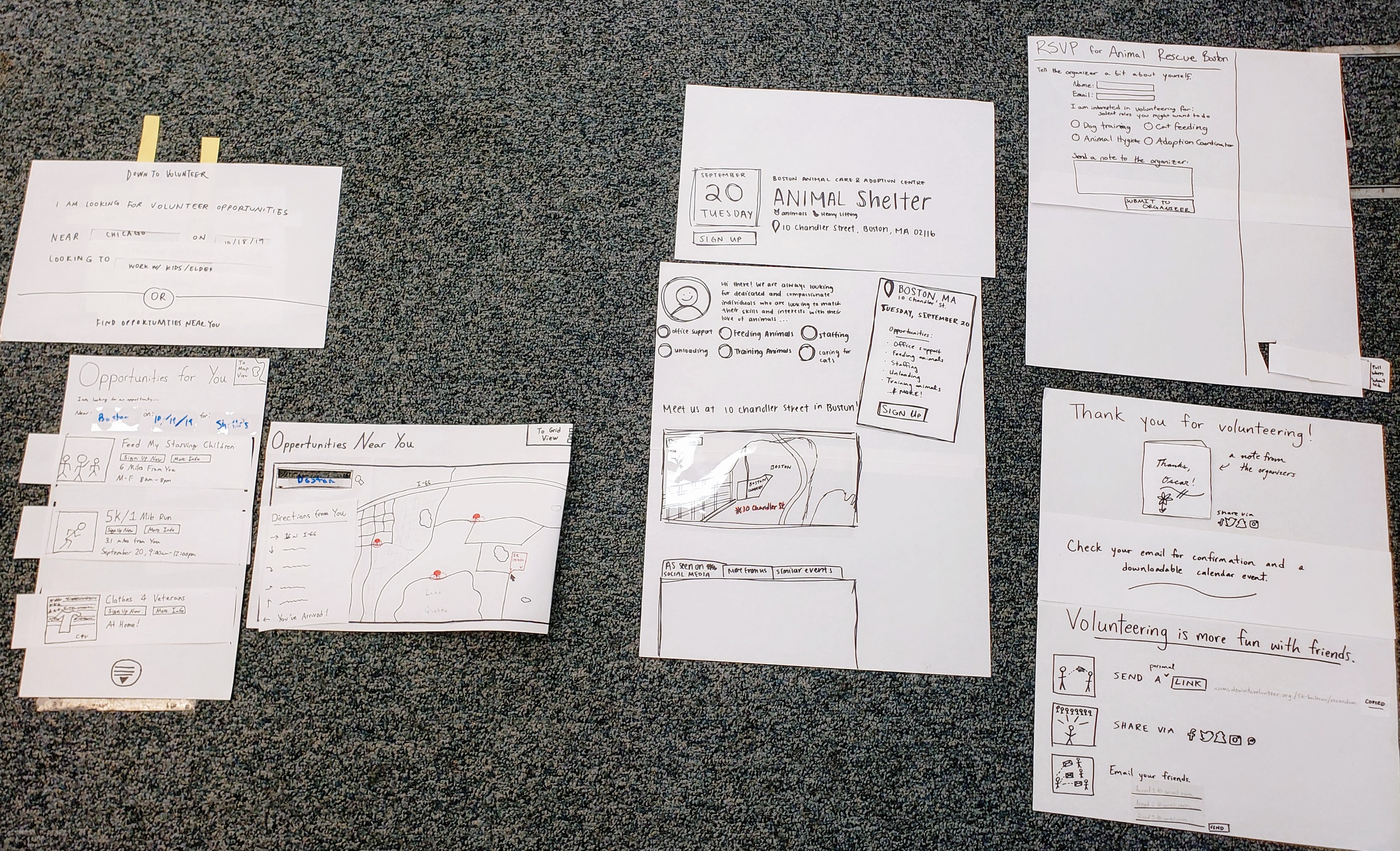
Starting the phase we had a curated understanding of our users through interviews, immersive volunteering, and synthesising activities. We used this gathered information to create paper prototypes before moving on to digital prototyping in the next phase. These paper protypes allowed us to iterate quickly and find flaws in our choices and assumptions.
The first draft of this paper prototype, incorportating what we learned from our users in the needs analysis phase, is shown below. Then we went on to run tests with users, gather more context-specific feedback, and let that inform new changes.
Home + Browse Pages
Version 1
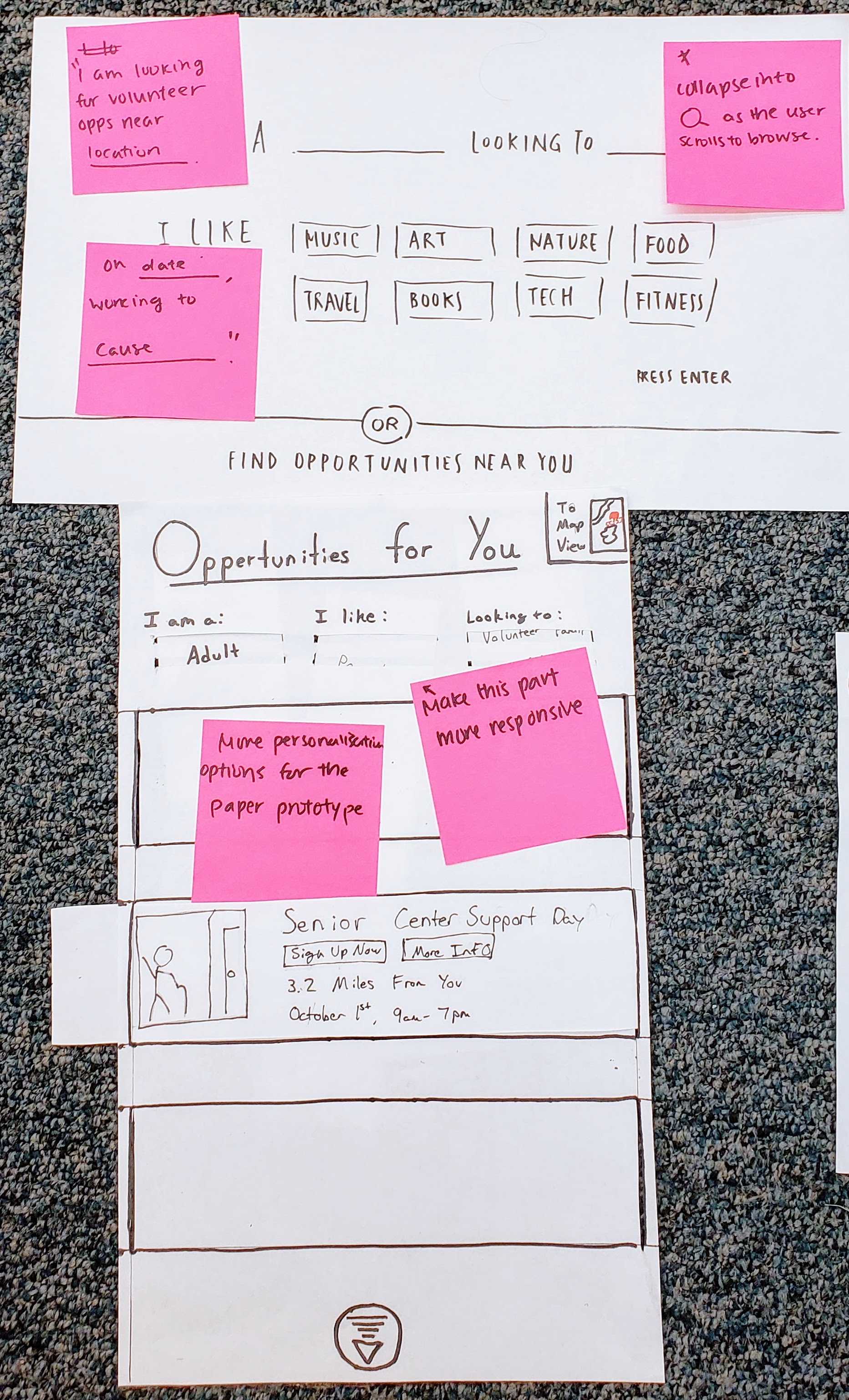
Changes Made
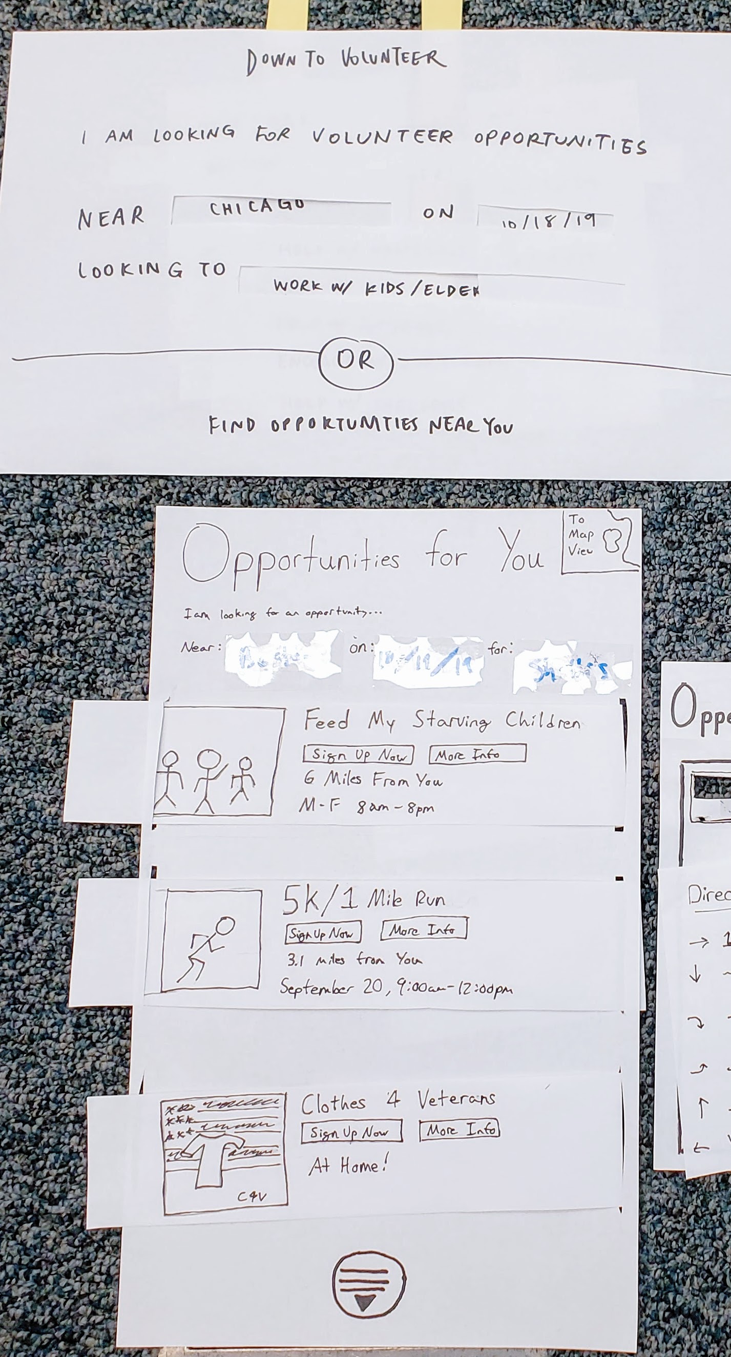
User Flow: One of the big decisions we made was how directly we wanted to bring users to the volunteering sign up page. We broke this up into two options, each of which targets a different user.
1. Browse to Information to Signup
2. Browse to Signup (shortcutting the additional information
The additional information approach required in the signup workflow is targeted toward new volunteers who are interested in “window shopping” and learning about different opportunities and signing up. The other approach is for the experienced user, someone who comes to the site with an already existing mission in mind and may feel inconvenienced by additional clicks. We tested both of these flows on users to ensure they were functional and intuitive.
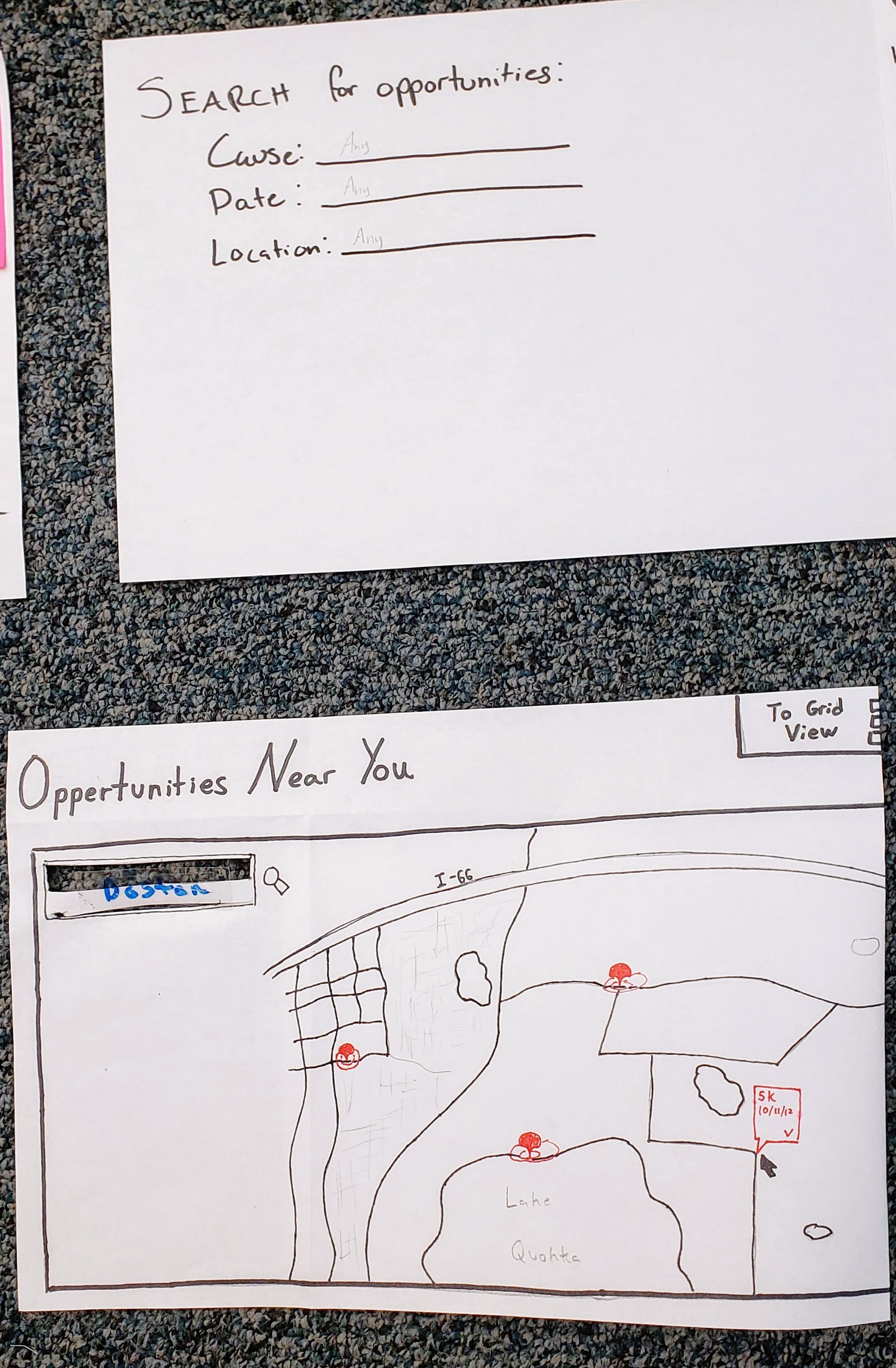
Grid and map layouts tossed: Single strips won out because grid view (not shown) was deemed too cluttered, especially with the 4 pieces of information and a picture we were putting into each one. With limited options as is, we don’t want users skimming pages and missing something just because they were too cluttered.
At the start of this phase, we thought an option for browsing by map view would meet user needs to minimize travel (shown to the right). However, in user testing this proved to be confusing and unable to convey the information clearly. Ultimately we removed it and went fully with strip listings, with visual location information (i.e. map) moved to the event pages themselves.
Version 2
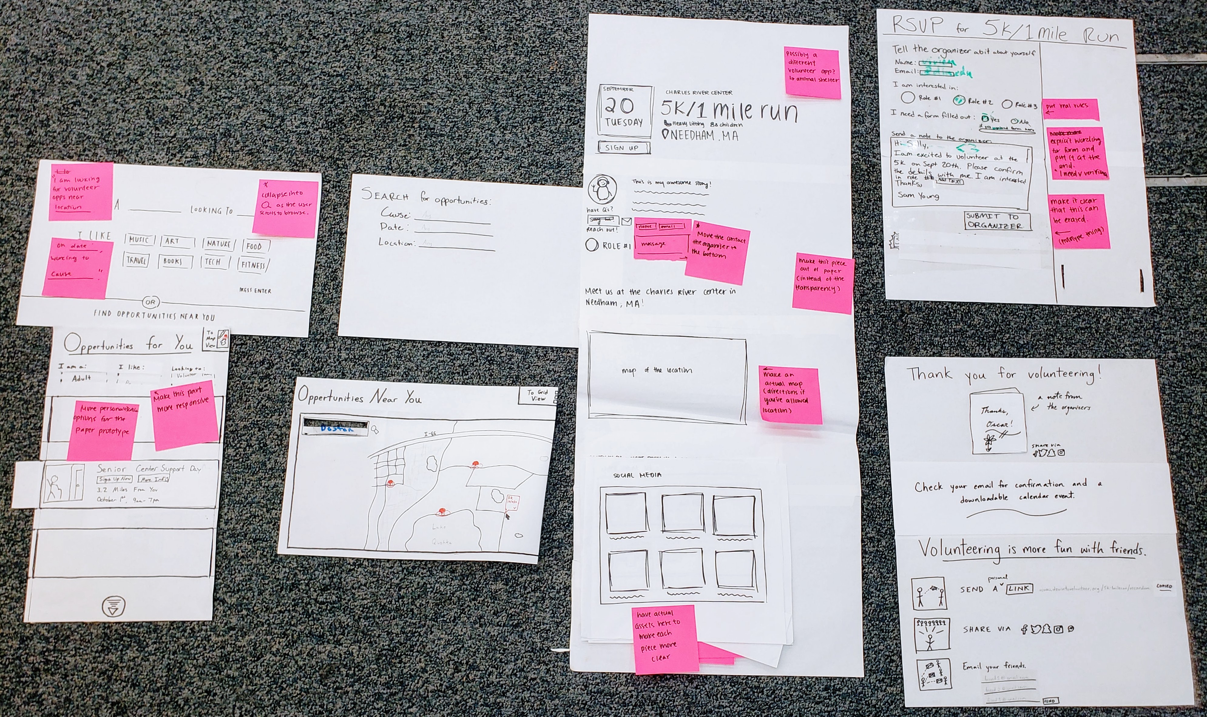
Event Info Page
Version 1
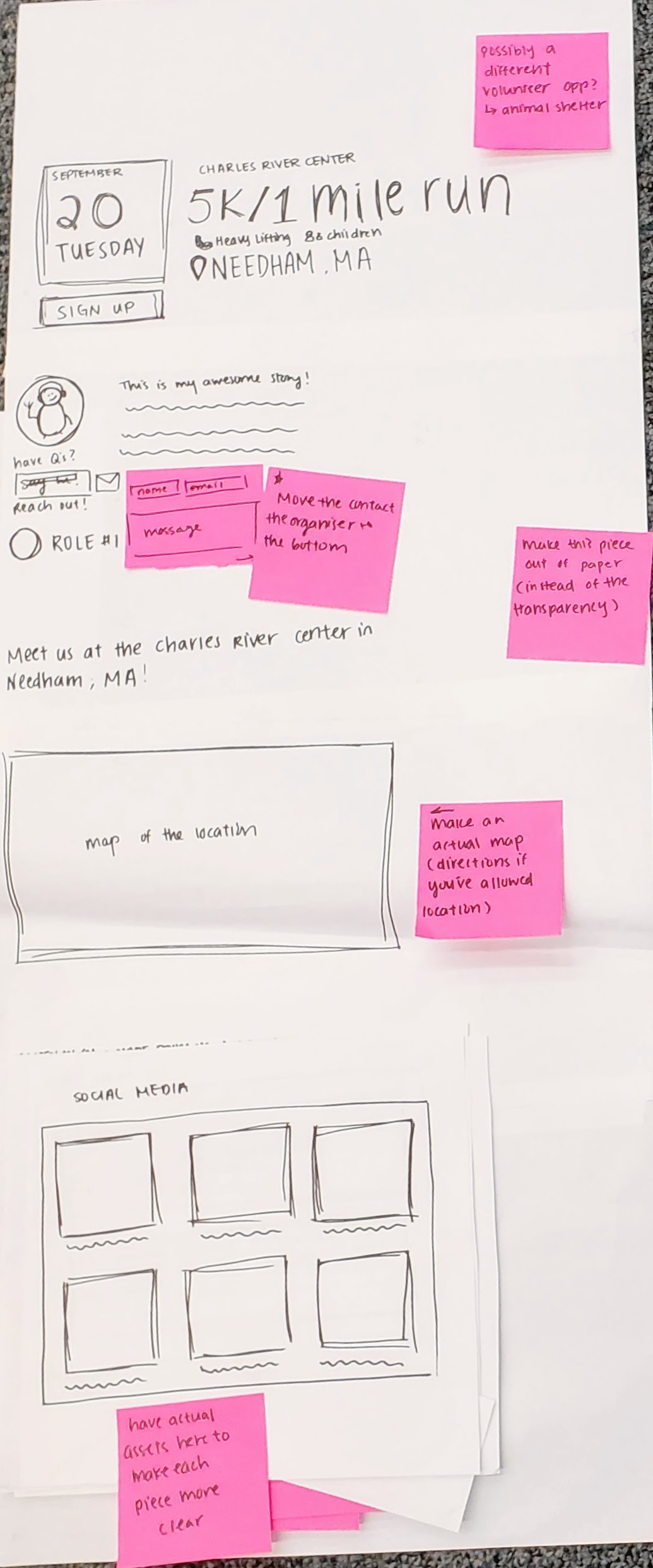
Changes Made
Additional Info: We added a section at the bottom of the page consisting of three tabs that users can switch between - photos from social media, more events from the same volunteer organizers, and more events similar to the one they are viewing - in order to increase visual appeal and encourage them to continue browsing if they decide this event isn’t for them.
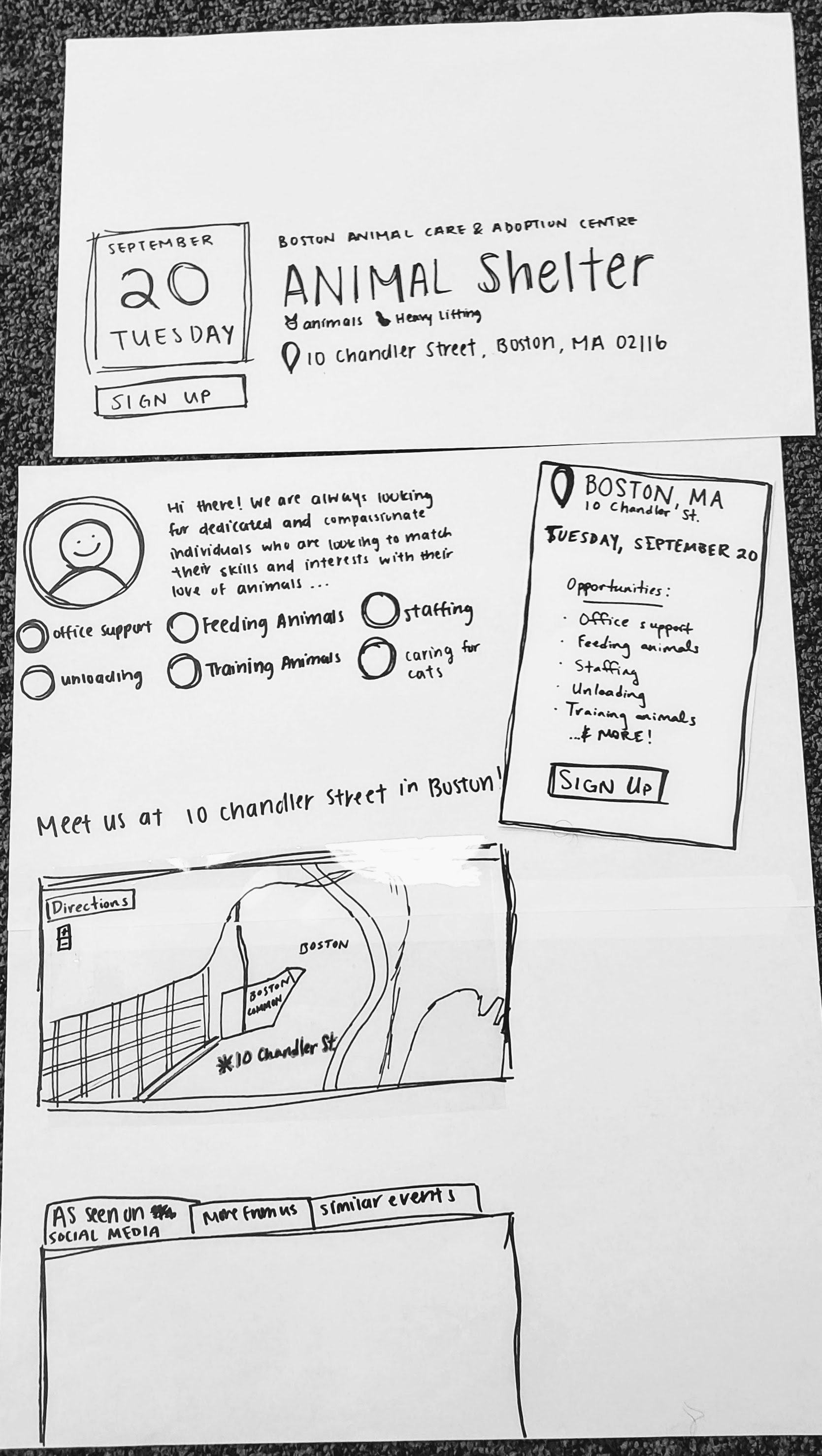
Version 2
RSVP + Thank You Pages
Version 1
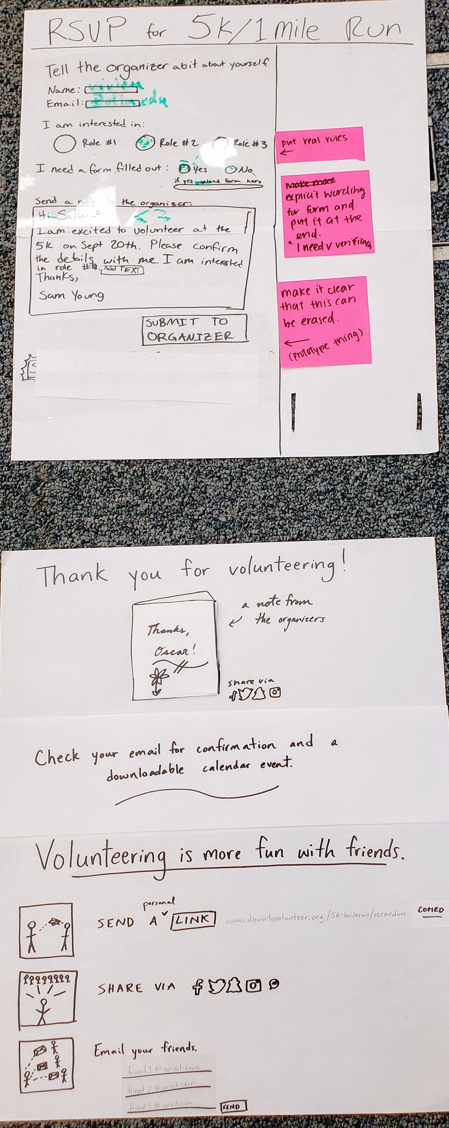
Changes Made
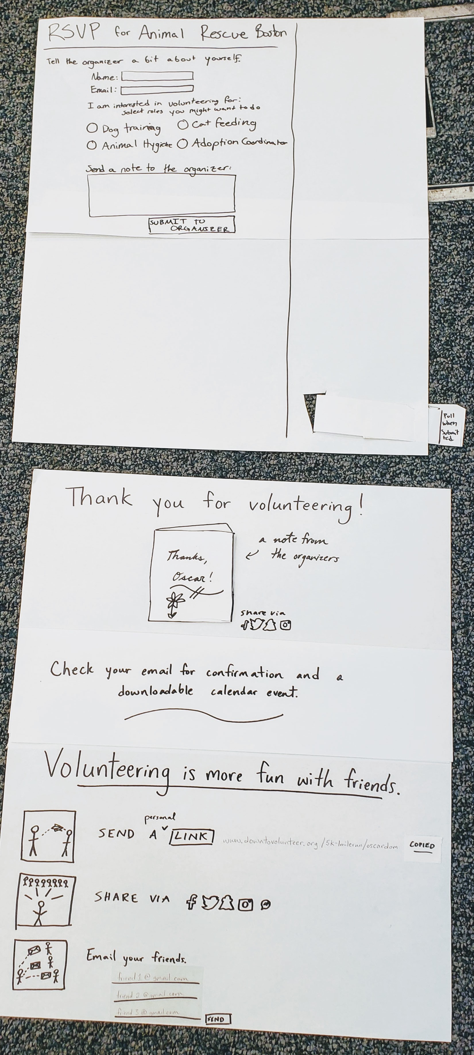
Version 2
Throughout these user tests, we were alerted to several other minor problems with our design, mostly confusing terminology or unclear UI, which we changed to give us our second draft, shown below. It was positive to hear that the underlying structure of the site made sense to the users.
∑ Individual Efforts < Team Results
Throughout this phase we each took ownership of a different page in the site and divided some other roles as well, documented below.Philipa: In the design development phase I worked on creating the “more information about the event” page. This included sketching out wireframes, refining layout and content ideas through internal team feedback, and creating and iterating on the paper prototype. We also collectively offered critique for each other’s work throughout the phase.
Sam: I developed the RSVP page paper prototype. I gave feedback on and helped rethink other pages. I designed different browsing experiences and worked as the computer on user feedback sessions.
Gracey: In the development of the paper prototype, I led the thank-you page from first draft through testing, feedback and second iteration. I also worked on the website page documenting our process.
Ben: In the design development phase I drafted the browse pages (map format and grid format) and iterated and tweaked different updates to them as we gained insights and feedback through user testing and internal team reviews. Map view was cut in the end but elements of it carried on through to other parts of the design.
April: In this phase, I mainly focused on developing, iterating and designing an effective user experience, impression and flow the homepage. This included drafting initial ideas to create the paper prototype of it. I also participated in the discussion and feedback sessions we held as a team.