Formal Usability Study
Why do it?
Formal usability studies are designed to answer concrete questions about specific aspects of your design (or about some other aspect of human-computer interaction). In order to be able to gather rigorous data, we designed an experiment that holds most things constant while varying only the element (the "factor") that we wished to test. We then measured the "response variable" to see how changes in the factor affect that response.The Experiment
Question: Where should we place our filters (top, left, or right) and how many events should we display in each row on the search page to optimize user flow?Hypothesis: Users will be more aware of the filtering options if it is off to the side of the page as opposed directly on top of the information about events, because it’s one line on the top as opposed to a full square on the side.
Factors Being Tested: On the event listings (browse) page, we are testing the best location in which to place the filtering options. Everything on the page will be control variables (stay the same within the three tests) except the location of the filters. In Test 1, they will be at the top of the screen, in Test 2 they will be to the left and in Test 3 they will be to the right.
We will be collecting both quantitative and qualitative data on the response variables.
- Quantitatively: We will compare priority actions (what actions the user takes first) and how much they change their filters.
- Qualitatively: We will be asking our users about their search experience, specifically regarding the importance of filter use in their search experience. For instance, did they feel it was necessary to complete all filter options? Did they notice the filters and understand what they would be used for?
If our hypothesis is correct:
If our hypothesis is correct, we expect that users will interact more with the filters if they’re on the top. However, we don’t know how positive that is - we only want users to be interacting with the filters if they feel it’s helpful, not because they felt it was a necessary action based on its placement on the page.Who to test: We believe scale will be important in these decisions to determine where the "majority" voices lie, so we plan to speak with 20 people. We will be testing the varying condition of the filter location as well as the type of card, another question we have been struggling with, with mixed feedback on both direct to sign up and more information. Given the time frame for this study and the fact that we’ve been considering this question throughout our development process, we will only be going through 1 iteration.
The Results
What Happened
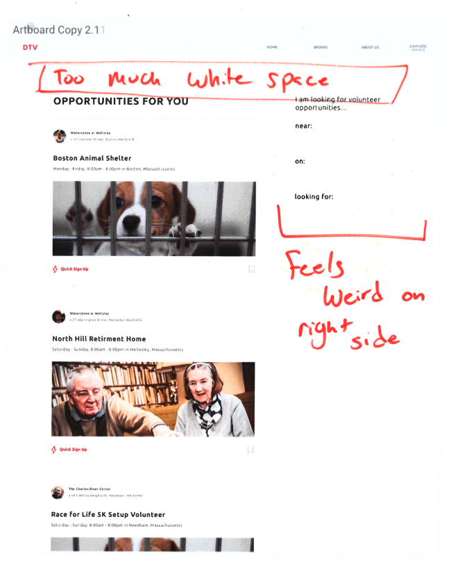
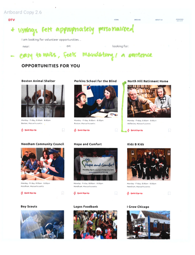
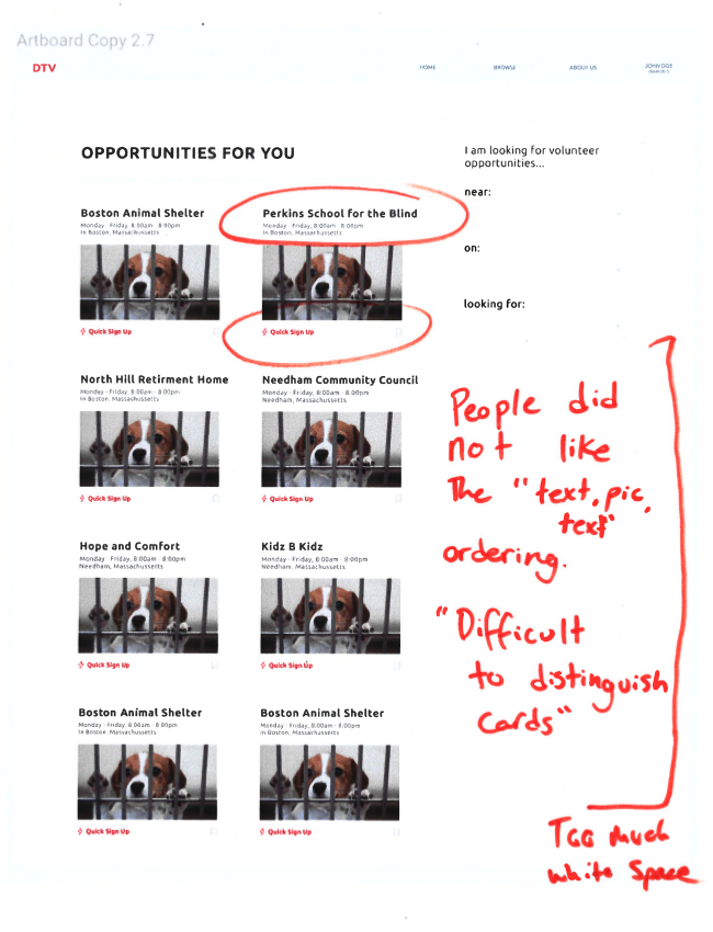
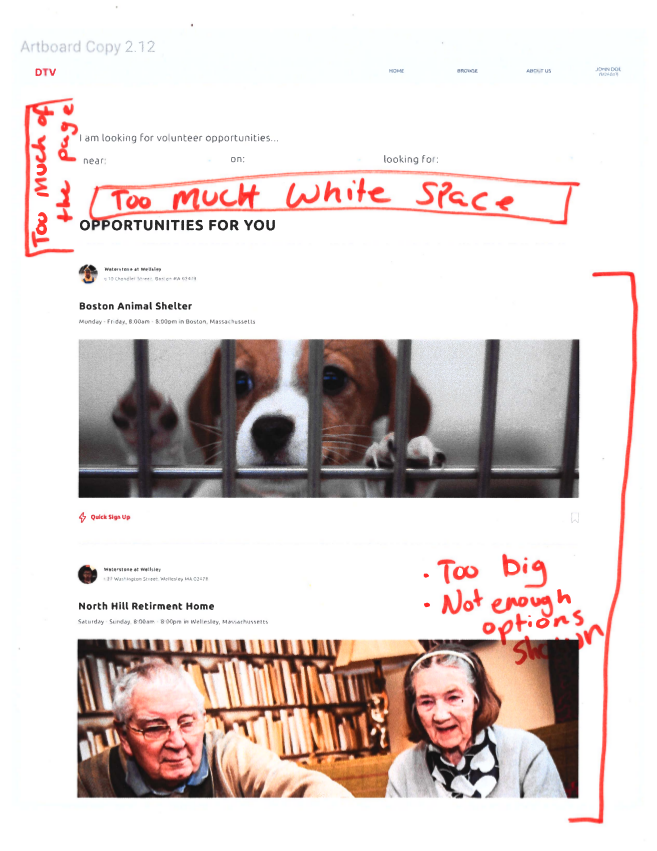
In this formal usability study we were measuring the engagement with filters, specifically in relation to other elements on the page, through its placement on the page. We also looked at analyzing the sentiment around the filters i.e. Were they an annoyance? Did they seem required?Through 24 interviews with potential users, including both formal and informal, we founds some common themes among the results. In these tests we presented users with 17 different card layout options primarily varying filter location on the page, size of cards, and text placement in cards. Some common threads we saw included the overwhelming white space that occured when the filter option was on either the left or right side. Additionally users felt in most of the options that the images were too large and were distracting from the information needed to make a decision about user signup. This was especially prevalent in the “one column” designs.
We found that users who were more familiar with online shopping, while preferring it off to the left like filters in Target or Amazon sites, actually engaged with the filters more when it was located at the top. This additional engagement was unfortunately not because they necessarily felt it would be of more use but rather its placement being different than what they expected as well as its linear sentence structure created a sentiment that it needed to be filled in to progress.
Key Feedback
- Images too large, distracting, especially one column. It’s a chore to read the text. Less picture, more text/info
- Want to know what specific kinds of work they would be doing
- Do we really need to display the times of the event?
- Specific locations
- Scrolling is a pain
- Top filter, 3 cards per row felt “impersonal”
- Expectation of things on the left (e.g. Amazon)
- How to choose between directly opposing opinions
- Text sandwich (text on top, then image, then quick sign up) was unclear where card ended
- Filter on sides would be good IF they hover
- If filters on top, could have a “return to top” button like blogging sites
- Difference between us and Amazon: people know what they are looking for already with Amazon and (probably) don’t with us
What We Changed
Filter Location: From the results of our study, we concluded that stationing the filters on the top of the page would be the best solution. One of our assumptions going into this study was that our filters acted like those of Amazon’s when they were off to the left. However after getting feedback and discussing it, we realized that our users differ greatly in mindset from users of Amazon. Typically users already have a strong idea of what they want to buy when they visit Amazon, whereas it is more likely they will be browsing or unsure of what opportunities are out there when they visit our site. Because we don’t want to clutter our users’ screens (and Figma doesn’t have this functionality), we have decided to forego the floating filter box on one of the sides and instead keep it at the top. Users have likely already filled in their preferences from the homescreen and having the box constantly would continue to clutter the screen. Instead for maneuvering we will use a “return to top” button like many card or blogging sites do.Events Layout: Many users felt the large-scale images in the single and even to some extent double columns claimed too much of the focus in hierarchy and made the text, which should be the most important, difficult to focus on. Because of this we have chosen a smaller, card-based system and are also adding a one-sentence description of the kinds of work available at each organization. This has strong matching to the real world with other card-layout sites. We also plan to perform one additional round of AB testing comparing different options for text placement around the image within each card now that we’ve decided on the number of columns to show.
Looking Ahead
After our discussion, we narrowed our designs to 4 versions of the website - all of them have filters on the top, but they differ in columns (two or three) and placement of text in relation to the photo (either all below the photo or sandwiching the photo).Moving forward, we plan to create a Google form with screenshots of each of them and send out to at least 50 people to gauge their preference. Based on people’s votes, we can then decide on the final layout of our browse page. However, this is with the assumption that there will be a clear “winner”. If there are two or three layouts that are very close in vote numbers, we may discuss further as a team, with our website goals, purpose and users in mind, and make an executive decision.