Inspirational Designs
Existing resources we found during our research in the space.
Some we'll take inspiration from, others we'll learn from.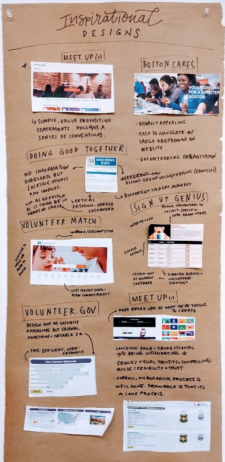
Volunteer Match
Researched by Gracey
“VolunteerMatch matches inspired people with inspiring causes. It’s how volunteers and nonprofits connect to achieve remarkable outcomes.” - VolunteerMatch homepage
In functionality, VolunteerMatch is very similar to what we hope to build. As their blurb above explains, they provide a platform for nonprofits to list events/programs for which they need volunteers, which potential volunteers can then peruse to find causes they’re interested in and contact the organizations.
However, many of the volunteer opportunities listed are longer-term commitments such as “raise a guide dog” or “be a mentor”. Because our aim is to make volunteering an accessible, inexpensive option for social activity, we are looking to provide a similar service, but for more urgent, last-minute events.
We can take inspiration from their website, which is much more modern and elegant than many of the other resources we’ve found that list volunteer opportunities.
We can also take inspiration from their onboarding process for new organizations, a summary of which is shown below.
SignUp Genius
Researched by Ben
I took a look at “SignupGenius.com”, a website and app intended to help make it easy and convenient for participants who already know about an event to sign up for specific roles or time slots. Often this is used by volunteering event organizers to ensure all roles are filled at all times and this is even stated as one of the ways the site is most used.
One good thing about the site is that it allows organizers to collect specific information about those signing up like names, emails, and phone numbers while also providing a space for feedback and questions as well as the organizer’s contact information. This two way line of communication is important especially to our project as questions crop up and being unsure or in the dark can be a big reason people don’t show up. Additionally having to give information for someone who has already taken the time to look over the possible roles make the volunteer feel more responsible for the task they signed up for, knowing they provided a way for the organizer to contact them, unlike a Facebook event. The layout and simplicity of the site also make for users having an easy time with it. The signup pages clearly layout all the necessary information about the event and the specific role meaning the volunteer knows what they are signing up for.
While great for managing already committed volunteers, one disadvantage of the service is finding events or volunteers. Volunteers must find the sign-up page through an external link. While this link can of course be emailed, incorporated into a website, or included in a Facebook group, the inability to find or search for public events on SignGenius’ site itself is limiting. This is especially relevant to us as we try to find a way to more easily connect volunteers and organizers during their search for one another. Another potential downside is that by just signing up for a time slot, a volunteer may feel like this is more of clock-in-clock-out type work rather than the natural interaction and very human centered help that tends to lead to better retention of volunteers.
Volunteer.gov
Researched by Sam
Volunteer.gov is a government issued website that allows users to find volunteering opportunities regarding nature and culture. Although the design of the website is not the most visually appealing, several functions of the site are notable. There additionally are problems with the site that detract so much from the experience of the site that they can serve as caveats to web developers.
What Works:
Widgets like this “find opportunities by state” selection showed how even poor visual design can be engaging. The ability to see where you are in the country and then click on your state gives the user a feeling of ownership and allegiance to their state which promotes engagement and volunteerism. Clicking on ones state then leads to a database view of all the volunteering opportunities in that state. This is a fast, efficient and user friendly way to get users into the database information results.
What Doesn't:
I felt extremely intimidated by this “Find a Volunteer Opportunity” input. The combination of the thin words and the dark answer boxes made the site seem unapproachable and like it required a lot of information from me. This form automatically gave a message different than the intended purpose of the project, make volunteering more approachable. There is no indication that I do not have to fill in all of the options and I am nervous to click the bright green search button in fear of an error message. This poor design choice highlights the importance of simplicity and functionality. This design is very functional and good for those who know exactly what they are looking for however for the general user, the site would seem unapproachable and they would lose interest. Had the input form been made differently I would be less frustrated and have a more enjoyable time on the sight.
The home page has several widgets for seemingly promising features like event calendars and volunteer time recording. I was excited to use these features however upon clicking on the calendar I found it unpopulated. I checked several dates and each led to a blank screen. This led me to feeling very frustrated with the website, it wasted my time and let me down. I learned just how important placement and size is on the homescreen. This large widget drew my eye and when I clicked on it I believed it had important information. I was misled by the homepage design.
Meetup
Researched by Philipa
This is a more broad version of what we are looking to create. There are already opportunities for volunteering on the platform but it is not optimized to encourage volunteerism and it is not tailored towards community volunteer organizers. Meetup is a very well designed platform and there are a lot interactions that are worth mimicking/observing. I mainly focused on the areas that I anticipate will be difficult for us to make user friendly given the nature of our platform (where we are tailoring to both the potential volunteers and the volunteer organizers).
The landing page is fairly standard and follows a series conventions (menu in the top left, call to action in the above the fold content, simple value proposition statement on top of a full bleed image background). This approach makes the platform appear professional without and intimidating to less tech savvy users. Our platform should strive to project a similar combination of intentional design choices and ease of use. That said, the follow proposition is a little unclear in this case. It is not immediately clear to the user what Meetup is about.
Introduction to Meetup for new users
Meetup does a really good job of highlighting the app’s functionality in both a highly visual (the categories and related iconography) and objective explanatory way (the “How Meetup Works” section). We will also need to find a way to engage users and distill the platform’s various functions to a succinct combination of icons and phrases. Moreover, the graphics for the categories introduce the brand’s visual identity in a compelling yet subtle way. Establishing a strong brand will help our platform build credibility and trust with potential users. As a platform, this will be essential to our adoption rate (especially at the beginning).
Onboarding Process
Overall the onboarding process is very well done. The copy clearly explains what the user needs to do in each step and fits in with the company’s brand. The use of more colloquial language also makes the steps easier to follow along with. However, this is a very long onboarding process. The user does not get to see the main dashboard until the 6th screen. The complexity seems necessary for the purposes of Meetup but we might have to explore ways to simplify the flow in order to ensure user retention.
Doing Good Together
Researched by April
This organization has a different target market from us, as they aim to empower families to raise caring, engaged children. They do this by offering listing of local programs and events, valuable services, and fun activities that promote kindness and giving.
On the website, there is a tab called “Volunteer Together”. The first thing that appears on that page once you select a location is a display of information, and when you scroll down, there is the opportunity to sign up for updates and news on volunteering. On the page, “Boston Family Volunteer Opportunities” listing highlighted in a red color, which indicates that it is both important and clickable. Once you click on it, it then loads a page with events listed, all in a vertical fashion in a single column.
One thing we can be inspired by is how easy and simple it is - there is no information overload. Also, the option to subscribe or sign up for a newsletter is a component that we can implement to the bottom of our web pages. However, one thing I noticed that the platform is lacking in, especially with the listings, is visuals and images. Also, because the listing is all stacked single column, it can be a little burdensome for the potential volunteer to continuously scroll through. It may be better for us to have multiple columns that allow the user to glance at all the options quickly through an overview, or allow for the user to filter through the events.
Additional Research
http://www.needhamma.gov/DocumentCenter/View/15135 Needham’s town volunteer opportunities. Last updated in 2017.
https://www.bostoncares.org/ Aesthetic boston website about a volunteering organization. Large photos and easy dropdowns make the website visually appealing and easy to navigate.
https://www.ncvo.org.uk/about-us Informational volunteering site with based on information distribution.
Facebook events take socializing and event going and connects them through social media.